Osper login prompt
How a small change to Osper’s onboarding flow increased the % of users logging in.
UX Lead, 2015
The problem
Osper was a product intended to help young people save and be responsible managing their money.
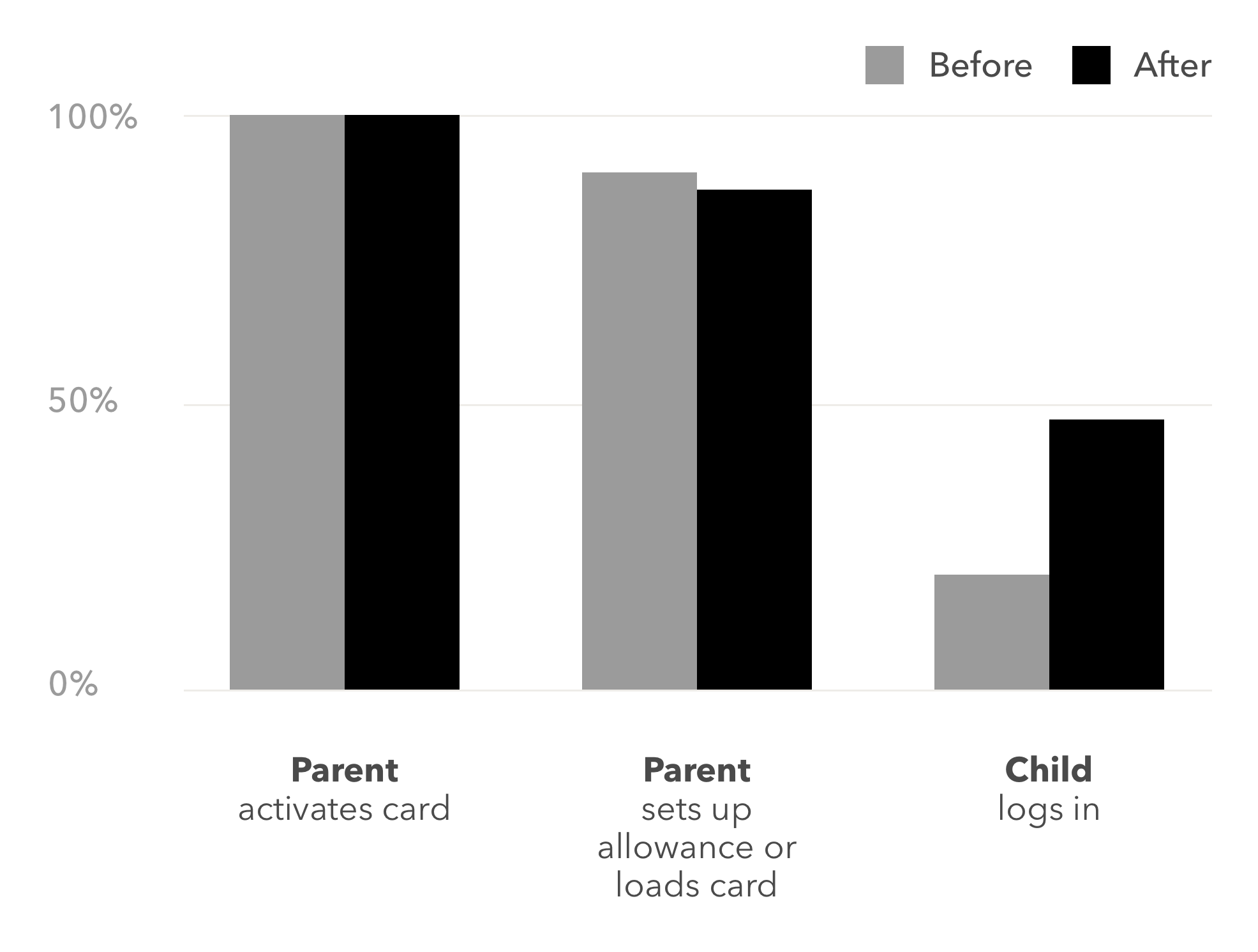
But looking at analytics while working on something else, we noticed only 20% of young people were logging in. The majority of families used Osper through the parent’s account. While they still could access core functionality, such as buying something online, it meant most young people weren’t using it independently.
This was supported by what we observed in user research I conducted for a feature called Osper Learn. We had found some parents didn’t realise there was a separate account. And it made sense, as the onboarding process didn’t encourage them to help young people log in.
What we did
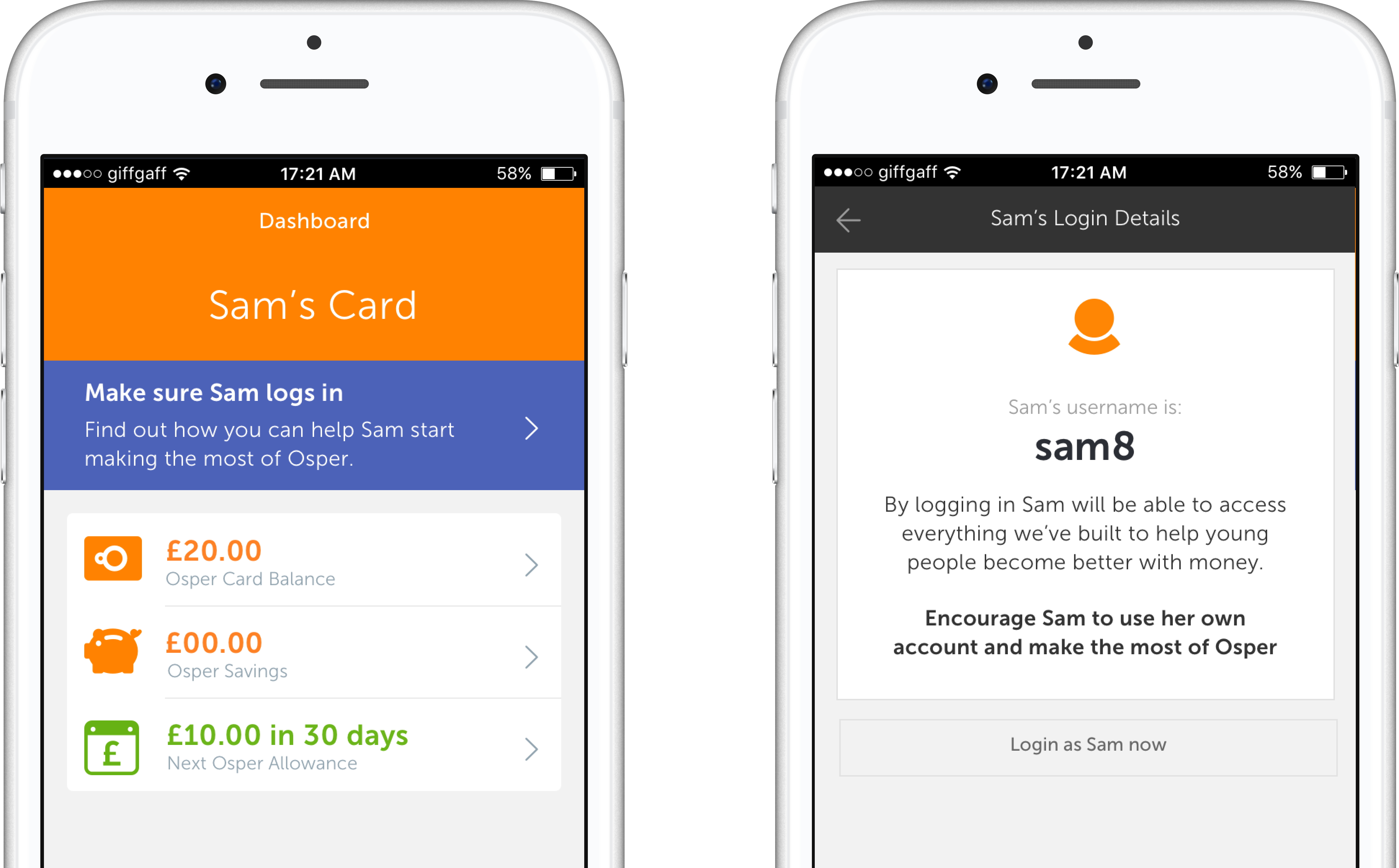
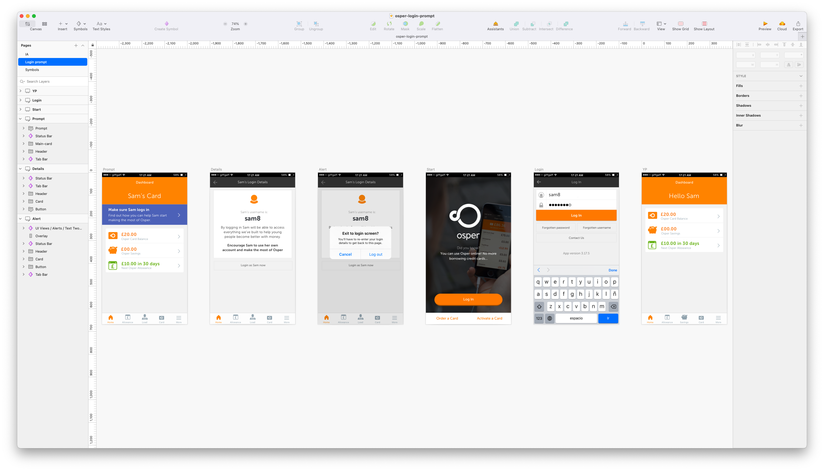
To be able to fit this alongside all the work we already had in progress, it had to be a short, quick turnaround. After analysing the data and a chat within the team, I mocked up the new flow.
Once we saw it prototyped, we were confident enough to release it and see what the results were, without additional research or a bigger piece of work. Within days from identifying the problem, the prompt was live and having an impact.
Results
46% of young people logged in after activating their card, up from 20% before the release.